

Color is one of the most powerful elements in fashion, especially when it comes to standing out in photographs and on the runway. I’ve learned that color isn’t just about what looks good, it’s also about what the camera and lighting capture best, and how the hues complement the model’s skin tone, mood of the shoot, and even the designer’s vision.
When I started refining my wardrobe for photo shoots and runway jobs, I realized that choosing the right colors made a massive difference in how I appeared on camera and under the lights. Some colors washed me out, while others made me glow. Now, whenever I prep for a shoot or walk, I think carefully about the palette I’m bringing into frame. Let me walk you through the best colors for photographs and runway and how to use them to elevate your modeling game.
Why Color Matters More Than You Think
Photographers often stress about lighting and shadows, but models need to be just as tuned in to color. A bright outfit might look amazing in person but become a disaster under studio lighting. Conversely, a soft, neutral piece might look too dull in real life but take on new life through the lens.
Color communicates mood, tone, and energy. A red dress can scream power and passion. A pastel blue can whisper elegance and calm. Each tone has its time and place, and understanding how it behaves in different settings is essential for building a versatile modeling career.
Power Neutrals That Always Work
Neutrals might sound basic, but they are some of the safest and smartest color choices for both photos and runway. Colors like white, black, beige, camel, gray, and ivory act as a blank canvas, letting your face and features stand out rather than your clothes stealing the show.
I’ve worn crisp white shirts in test shoots that made my complexion pop without pulling attention from my expression. Black always brings an edgy, elegant vibe and works across nearly every setting, studio, outdoor, runway, or editorial. Gray and beige add a soft, high-fashion feel that plays well under professional lighting. These tones help photographers focus on your shape, angles, and presence.
Neutrals are also easy to mix and layer, giving you tons of styling flexibility while keeping the focus where it should be, on you.
Jewel Tones That Capture Light Perfectly
When I want to bring more life to a shoot or walk, I often reach for jewel tones. Emerald green, sapphire blue, ruby red, and amethyst purple have this richness that really comes alive in front of the lens.
These shades have depth. They don’t flatten or overexpose the way bright neons or high-luminance shades sometimes do. Instead, they reflect light beautifully, contouring the body and catching just enough attention. Jewel tones can also give you an instant luxe look without having to go over the top.
Emerald green, in particular, has been one of my go-to colors for fall campaigns, while ruby red makes a bold statement on the runway. They work across all skin tones too, just tweak the saturation slightly to suit your undertone.
Earth Tones That Highlight Natural Beauty
For more organic or lifestyle-style shoots, earth tones are my secret weapon. Think olive, rust, burnt sienna, terracotta, tan, and warm browns. These colors have a way of harmonizing with outdoor settings and skin tones, making everything look seamless and natural.
When I shoot in natural light, wearing earth tones makes me blend in without fading away. They enhance natural features like freckles, hair texture, and eye color. These hues don’t compete with the background; instead, they work with it to create a cohesive visual story.
On the runway, earth tones are increasingly being used in minimalist and sustainable fashion collections. They exude authenticity and calm, which contrasts beautifully with the high-energy atmosphere of fashion shows.
Pastels That Pop Under Soft Lighting
Soft pinks, baby blues, lavender, butter yellow, and mint green might not scream runway drama, but they’re stunning in the right setting. Pastels photograph incredibly well under soft light, especially in editorial or beauty shoots that focus on close-ups.
I’ve worn pastel pink and powder blue for several beauty campaigns, and the colors brought a softness and youthfulness to the final images. They reflect light gently and can give skin a luminous, healthy look, especially when paired with the right makeup and background.
Pastels work well when the goal is to create a gentle, whimsical, or romantic vibe. If you’re doing spring fashion or bridal shoots, they should definitely be in your wardrobe rotation.
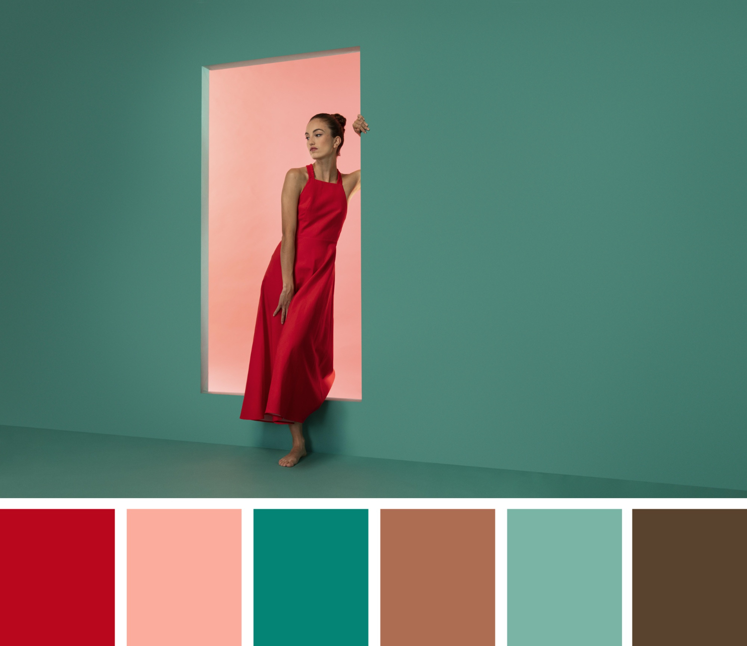
High-Impact Reds and Yellows
Red is one of the most emotionally powerful colors you can wear. It draws attention instantly, so it’s perfect when you want to make a statement. On the runway, a red outfit often becomes the showstopper, demanding all eyes. I’ve found that different shades of red can tell different stories, scarlet for passion, wine for sophistication, and coral for energy.
Yellow, on the other hand, can be tricky. Some shades of yellow wash out on camera or clash with lighting. But mustard, goldenrod, and sunflower yellow? They hit just right. These warmer tones radiate joy and personality. I love wearing yellow in outdoor shoots where natural light brings out its vibrancy.
Both red and yellow should be worn with intention. They’re bold, so you don’t need intricate designs or loud accessories, let the color do the talking.
Avoiding Problematic Colors
Not every color works well for photographs and runway. Neon shades can blow out under flash or look garish in high-definition. I’ve worn neon green once on a test shoot, and it reflected onto my skin in the photos, creating an unnatural glow.
Be cautious with overly bright whites too, they can reflect too much light and blow out details. Pale shades that closely match your skin tone can also make you look washed out, especially under bright lights.
Patterned outfits can also be risky. Tiny stripes may cause a moiré effect on camera, and busy prints can be distracting. When in doubt, I go solid or minimal.
Matching Color With Your Skin Tone
One of the biggest game-changers in my modeling wardrobe was learning which colors complement my skin tone. For warm undertones, colors like gold, olive, rust, and orange work beautifully. For cooler tones, jewel shades, blue-based reds, and icy pastels tend to shine.
Neutral undertones? Lucky you, most shades will work well. But even with this flexibility, the goal should always be to enhance your features rather than distract from them.
Try doing a quick test in natural light to see which tones brighten your face and which dull it. It’s subtle, but once you get it right, the difference is huge.
Matching Color With the Concept
The best colors for photographs and runway also depend heavily on the concept of the shoot or show. If the shoot is editorial and moody, muted tones or rich darks might be perfect. If it’s for a summer campaign, vibrant and fresh tones make more sense.
I always ask what the theme is before picking out what to wear. Being in sync with the concept not only ensures I don’t clash with the set, but it also helps me bring more authenticity and cohesion to the look.
If you’re working with a stylist or creative director, they’ll usually guide you on color direction. But having your own sense of what works and what doesn’t will make their job easier, and show that you know your stuff.
Timeless vs Trend-Driven Shades
Some colors never go out of style. Black, white, red, and navy are timeless. They always have a place in fashion and photography. When I’m doing portfolio shoots or basic digitals, I rely on these because they’re clean, strong, and camera-friendly.
Trend-driven colors, however, can help you stand out if used thoughtfully. Every year has its “it” shades, think millennial pink, Pantone colors of the year, or seasonal runways introducing lime green or metallics.
I recommend balancing both. Keep a wardrobe base of timeless tones, but don’t be afraid to add a few trendy colors to stay relevant and versatile.
How to Experiment Without Going Overboard
Experimenting with color is important, but it should always serve the shoot or the walk. I’ve found that accessories, shoes, or makeup are great ways to test out bold or unfamiliar hues before committing to a full outfit.
If I’m unsure whether a certain color works for me or a shoot, I’ll try it in a controlled setting, like a test shoot with a photographer I trust. This way, I can see how it looks on camera before wearing it for a major campaign or casting.
Color can be your ally or your enemy. Use it wisely.
Final Thoughts
The best colors for photographs and runway are the ones that make you look vibrant, focused, and professional without overwhelming the camera or the audience. Whether it’s a soft pastel blouse for a spring campaign, a rich burgundy dress for a dramatic walk, or a simple white tee for a clean headshot, what you wear matters.
I always recommend taking time to observe how light interacts with your clothes, how colors make your skin look, and how they align with the story being told. Once you find your palette sweet spot, you’ll be amazed at how much more confident you feel in front of the lens or on the catwalk.
Make color work for you, because when it does, the results speak for themselves.
